Most great paintings use the principles of color harmony with the use of complementary colors.
Color harmony is also known as yin yang in painting and refers to the overall tone of the piece of art. This can be seen in many important works of art throughout the centuries.
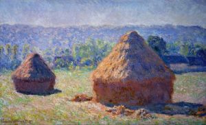
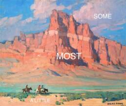
Monet’s haystack painting below is a perfect example of successfully using color harmony to create a work of art.
When I grasped the concept of color harmony and color temperature, as well as how to use the hidden meaning of color yin yang in painting I was able to push my paintings to a new level!
Yin (the moon, female) colors are considered to be cool, while yang (the sun, male) colors are warm. Again, it is the balance of opposites which attract to create the harmonic tone of the painting.
Interestingly enough, color harmony is another example of yin yang in painting. Yin (the moon, female) colors are considered to be cool, while yang (the sun, male) colors are warm. Again, it is the balance of opposites which attract to create the harmonic tone of the painting.
Most of you know that the primary colors on the wheel are obviously red, yellow and blue – from there, the complementary colors on the color wheel are actually opposite colors and temperatures.
The first diagram illustrates primary colors. The second diagram illustrates secondary colors. The colors opposite of each other are called complimentary colors.

(primary color wheel)
For example:
Red + Blue = Purple
Blue + Yellow = Green
Red + Yellow = Orange

Purple, green and orange are called secondary colors. From there you can keep mixing and creating beautiful tones and grays of different values.
Red and yellow are considered warm while blue is cool. That seems easy enough, but it becomes a bit complicated after that.
Cool colors (yin) recede while warm colors (yang) come forward. Look at any good landscape painting to see examples of this. The trees or grasses in the background will be cooler and will warm as they advance to the foreground of the painting.
But, wait there is more…
Within each color family, there is a myriad of warm and cool tones. Alizarin Crimson is a cool red, while Cadmium Red is warm. Cadmium Yellow is warm and Naples Yellow is cool. Cobalt Blue is cool and Ultramarine Blue is warm.
When you study your own palette and play with the paint, you will begin to see these subtle color variations that will help the overall feeling of harmony in your paintings.
This is just a quick tutorial about complimentary colors. There is so much more, but I won’t overwhelm you with that right now. Enjoy taking some time studying and painting until and you understand the power of using yin yang color harmony.
*****
You might like to read:
The Importance of Value & Tone in Painting
A Unique Approach Using Color Harmony to Improve Your Paintings
Thanks for this!
You are welcome, Tequitia! Thanks for the visit.
Lori 🙂
Lori
I also have this and find it to be a wonderful tool
Hi Arthur – thanks for the feedback. I appreciate you taking time to comment.
Best – Lori
Sorry, but I think ultramarine blue is a cool, not warm, color 🙂
Hi Evaldas, thanks for your comment.
Ultramarine Blue might be cool to you when compared to the other blues on your individual palette. For me, the brand of Ultramarine Blue that I use is warmer than cooler Cobalt Blue…of course we all know that blue is a cool color anyway…the temperature of all colors can change when used next to different pigments.
Take care – Lori
Could you expand on the idea of color familys Please?
Thank you
enjoyed reading all the art information shared by you , thanks much Lori
Thank you Priyadarshi!
Hi Lori,
Just stumbled upon your page looking for blogging tips. Lucky me! Your posts are very informative and quite motivating in tone!
You’re a very inspirational woman 😀
Thanks so much! and Good Luck!
Can u write something abt how colors represent the human emotions, please
Philip, that is a topic I have covered in the past. But, I plan to do some more on ‘mood’ and color soon… For now, check this out. https://www.finearttips.com/2009/08/use-the-hidden-meaning-of-color-in-your-art/
Dear Lori,
Do you list your green/ red yin yang palette of colors anywhere?
Diana
Your paintings are beautiful!
Thank you Diana! I have not listed the other palettes, but plan to do so…thanks for the nudge.