After blogging for so many years, many of my favorite posts get buried. So, I decided to update this popular post! Below, I will reveal how you can use the secret meaning of color as a powerful tool in your own art.
Once the principles of color and its secret meanings are understood, you can bring more meaning to your art or craft!
Research shows that color can play a major role in our overall state of well-being. The colors we surround ourselves with directly influence the way we feel and relax. In art and design, color allows us to create our own individuality and flare. For years, interior decorators, graphic designers, advertisers and all types of artists have been using color to enhance our environments.
The secret meaning of color can be used to evoke a certain mood or to create a message or sharp response in the viewer. As artists we learn how to use the positive or negative attributes of color in our works to subliminally send a message. There are 6 colors which are proven to help boost sales!
The following examples illustrate how people react differently to cool and warm colors…
COOL COLORS
- Based on blue undertones and bring to mind a calming effect.
- These colors range from cold icy blues to warm and nurturing Mediterranean turquoises.
- Many decorators use these colors in spas, bathrooms and other quiet environments.
- Blues lower heart rate and reduces appetite.
- Blue represents dependability.
- It is commonly worn in uniforms and business suits.
- Dark blue is generally used by more authoritative figures including police officers and our Presidents!
- Blue and greens are used in advertising medicines and health care products.
- ‘Greenrooms’ of theaters are so called because their green walls are often used to steady the nerves of actors.
- Dark greens do well in offices and studies.
- Greens are commonly used for outdoor products.
WARM COLORS
- Based on yellow undertones and tend to convey emotions ranging from happiness to violence.
- Red, orange and yellow colors trigger hunger.
- This is why you see restaurants like McDonalds, Wendy’s and Burger King using these colors in their logos and advertising.
- Safeway, Walgreens and Costco all use red in their logos.
- Red instantly attracts, makes people excited and increases the heart rate.
- Just think of Coke and Red Bull!
Below I will share the hidden meaning of each color in the spectrum. But first, here is a brief lesson in Color Theory:
- Philosopher, Leone Battista Alberti (c. 1435) and artist/inventor Leonardo da Vinci (c. 1495) were the first known writings on color principles.
- In 1666, Isaac Newton’s Theory of Color and primary colors were introduced.
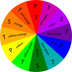
- Just over a hundred years after Newton’s discovery, Moses Harris created the first color wheel. It classified red, blue and yellow as the three primary colors.
Primary colors cannot be created by mixing any other colors together.
- Then in the early twentieth century, German painter, Johannes Itten extended the color wheel to include secondary and tertiary colors. He also pioneered the idea of warm and cool colors and principle that any shade of color can either have a warm base or a cool base.
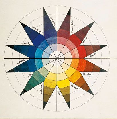 (Itten’s ground-breaking Color Star Chart featured twelve colors)
THREE PRIMARY COLORS
- RED
- YELLOW
- BLUE
THREE SECONDARY COLORS
Made by mixing the primary colors together
- RED + YELLOW =ORANGE
- YELLOW + BLUE = GREEN
- RED + BLUE = PURPLE
SIX TERTIARY
Made by mixing a primary and a secondary color together
TINTS & SHADES
Any color can be lightened by adding white, known as a tint. The same color can be darkened by adding black, known as a shade. Shades of white being more feminine and tints of black become more masculine
COMPLEMENTARY & COLOR HARMONY
Complementary colors have a strong visual impact when placed alongside another. Complementary colors are directly opposite each other on the color wheel.
- RED + GREEN
- BLUE + ORANGE
- YELLOW + PURPLE
Harmonious colors rest alongside each other in the color wheel.
Hint: Experiment with crayons to explore the relationship of different colors to each other and discover which combination appeals to you.
- YELLOW + ORANGE = harmony
- BLUE + PURPLE = harmony
THE MEANING OF COLOR:
RED
The color of strength, romance, excitement, vitality, physical power, outgoing, ambitious and impulsive. It is a color that flatters the skin and can make an excellent background. Pale pink are warm and peaceful and combine well with greens. The deeper reds create an atmosphere of retrained opulence and power. Red elicits an uncomplicated nature with a zest for life. But, red can also connote danger or threats. Fire engines, stop signs and traffic lights are a perfect example.
ORANGE
Midway between red and orange it is a cheerful color. It is a flamboyant and lively color. Orange can be assertive, dynamic, and spontaneous and signifies youth and fearlessness. Orange stimulates the brain and produces oxygen and mental activity. Dark-orange signifies deceit or distrust, whereas red-orange can correspond to aggression, domination and thirst for action.
YELLOW
We associate yellow with sunshine and it represents light. It creates a feeling of hope, happiness and wisdom. The color evokes an optimistic sense of well being and natural light. It is airy, radiant and atmospheric. Yellow gives the feeling that all is okay with the world. An example of this is Luminism, an early generation of landscape painters who explored ways to depict light realistically on canvas by using color to depict a melodramatic or romantic mood. But, yellow is a complicated color. On one hand, it is considered ‘light-hearted’ and childlike, but actually it is known to make babies cry.
Although, light-yellow represents intellect, freshness and joy, dull-yellow is associated with caution, decay, sickness and jealousy. But at times, yellow may symbolize cowardice. The phrase, ‘yellow-bellied-coward” came into use around 1910 which probably derives from yellow’s association with both treason and weakness. More than a millennium ago, Judas Iscariot was often portrayed in yellow clothing which symbolized his betrayal of Jesus Christ – a cowardly act. In America’s pioneer days, yellow dogs were considered worthless and the term “yellow dog” came to be used to describe anything worthless.
Our observation of the yellow of tree leaves as they age and die, as well as the yellowing of old books and papers, led to the association of yellow with old age and illness. But, yellow is very effective at attracting attention – think of a taxi cab. Yellow is also used as a warning symbol. In football, a ‘yellow flag’ issues a warning. When place alongside black, yellow issues a warning. Yellow is also used in traffic lights and signs to advice us of danger. The list goes on and on…
Hint: In painting light, use warm to cool colors against each other, not black to white
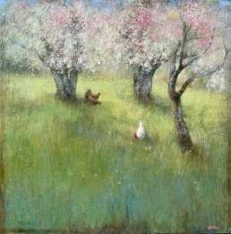
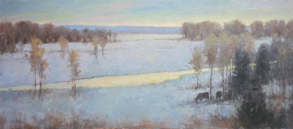 ©2019 Lori McNee
(The above painting has a calm, harmonious feeling. This serene environment was created by using muted tones and yellows, blues and dashes of their complimentary colors.)
GREEN
The color of harmony, balance and security. Green also has a calming effect and symbolic meaning of hope, peace, gentleness and modesty. It is soothing, refined and civilized with great healing power. Green suggests stability and endurance, hope and growth. It sometimes denotes lack of experience, for example a ‘green-horn’ is a novice. Pale greens are particularly restful. Dark greens remind us of money, banking and Wall Street. However, at times yellow-green is used to portray sickness, discord and jealousy. We’ve all heard the phrase, “green with envy.”
BLUE
The color of the sea and sky, it has a quality of cool expansiveness and openness. Soft, soothing, compassionate and caring, blue is an introspective color. Blue is often a formal color which represents wisdom and steady character. Many superheroes wear blue! It is considered a masculine color and the choice of corporate America. But, the quiet character and poetic subtlety of blue can also be associated with melancholy and resignation. Remember Pablo Picasso’s infamous “Blue Period” of art? Picasso’s personal trauma found expression in a series of deeply sentimental paintings which comprise his “Blue Period”. I even dedicated a helpful post to artists who find themselves Feeling Blue.
PURPLE
A combination of red and blue, purples are regal and dignified to be used with discretion. Pale shades are restful and serene, but the darker shades make it difficult to focus. Lavenders signify refined things in life, creative, witty and civilized. Purples can be tiring on the eyes and cause a sense of frustration, but it can make an excellent foil for works of art. Gloom and sad feelings can be portrayed by using purples.
BROWN:
The color of living wood and the earth. Rich, subtle and extraordinarily restful to look upon, brown creates a feeling of coolness and warmth at the same time. It combines well with rich colors such as purple and gold (popular in the Victorian era). It is a steady, dependable, conservative, conscientious and reliable color. Brown evokes a sense of nostalgia and reminds us of the great works of Rembrandt, Titian and Rubens. Tonalism used rich earth tones and muted colors to create moody landscapes. Van Gogh’s used a lot of brown to set a somber and depressed mood in the famous painting The Potato Eaters . Think back on Soviet Russia and you might remember the common people usually wore shades of brown.
GRAY
This color represents caution and compromise. Many beautiful grays can be made by mixing complimentary colors together. Grays give a sense of peace to the viewer.
WHITE
Symbolic of safety, cleanliness and purity. White emanates youth, perfection and innocence. Angels are usually thought of as white. White is simplicity and freshness, but too much can give a clinical feeling. Doctors, hospitals and sterility are associated the white. Low fat foods and dairy products use white in their packaging. But, in many Eastern cultures, white signifies death, mourning, funerals and unhappiness. Ghosts are white and giving white flowers to the sick is bad luck in many cultures. In painting, use white sparingly. It can make colors chalky and lifeless.
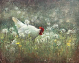
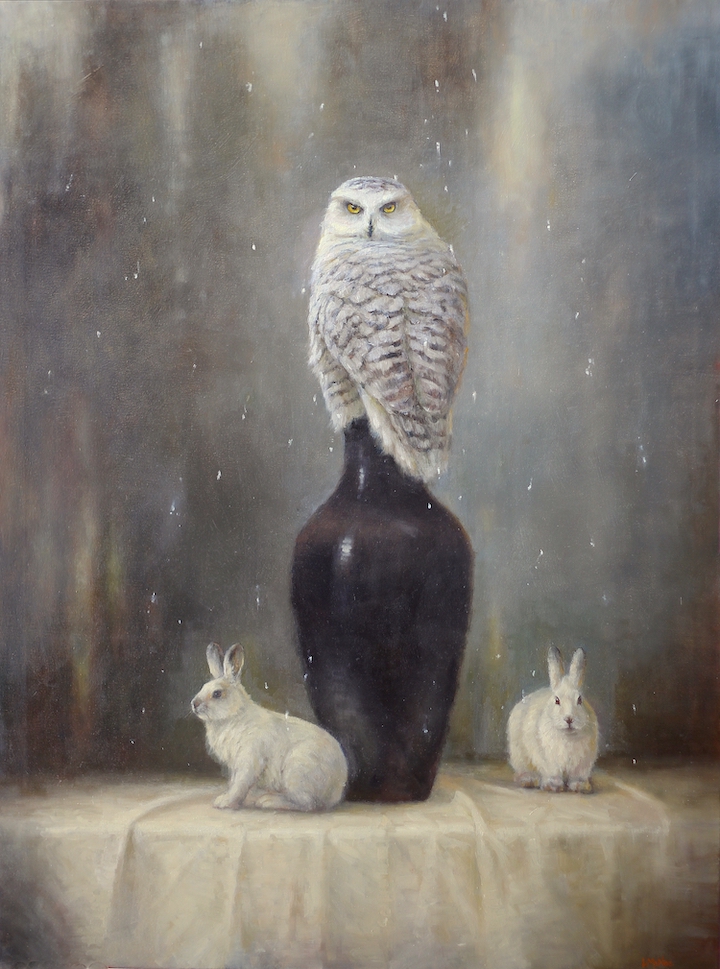 ©2019 Lori McNee, “Harey Situation” 48×36, oil on canvas
(The symbology and meaning of each color strikes a hidden message and restlessness in the viewer. In this painting I wanted to create a mysterious mood. Using black and dark greens helped achieve my goal. I rarely use black from the tube. I can mix a great ‘black’ with Ultra Marine Blue & Cadmium Orange or Burnt Umber.)
BLACK
Mysterious and hidden, black can give us a morbid feeling. For many, it causes a feeling of the unknown and negative connotations like, black-hole, blacklist, black-humor or black-death. In most Western cultures, black is the symbol of grief.
However, black can be dignified and showy with sophistication. Black will also punctuate color schemes that rely on strong contrasting colors. Try mixing your own blacks, rather than using it straight from the tube.
IN CONCLUSION
Most successful artists know how to use the secret meaning of color to their advantage, but many aspiring and novice artists are not aware of the power of color on the viewer. This article is NOT my abbreviated attempt at teaching color theory. Volumes of books on the subject could fill any room!
Nevertheless, I have shared with you a thought provoking overview on the color spectrum. Artists are always looking for ways to create meaning in their work. I hope this article has given you some fresh ideas about color. Try using the secret meaning of color to help you enhance your own paintings.