Understanding the proper use of temperature, tone and value in painting will help with the success of your art.
These principles can be applied whether you are plein air painting in the field, or working in portraiture, still lifes, or landscapes your studio. Here is a quick crash course of the subject.
Temperature
Temperature describes the degree of warmth found in a color or hue. For instance, a warm color gives the viewer a feeling of warmth such as the colors on a sunny day. A cool color gives a sense of coolness, like the colors on a rainy day.
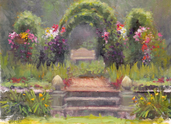
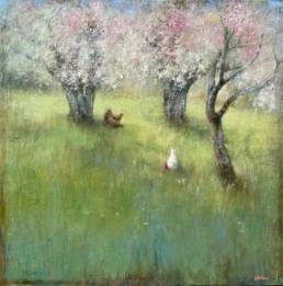
Temperature changes and value shifts where used in this plein air painting to portray a very green garden. The subtle changes to the warmth of the greens in the sunshine and the coolness of the greens in the background make the above painting sing.
Temperature also helped me create the illusion of distance. The warm colors come forward and cool colors recede.
Tone
A tone is made by adding a mixture of gray to the color.
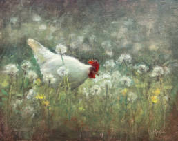
A tone is not a pure color. Observe the tones within this painting. Tones are made when you add both black and white to a hue or color – to tone it down or gray it down. Adding black or white will also change the value of that particular hue or color.
Learn more about color mixing here.
Value
Value on the other hand, is the lightness or darkness of a color or hue. Little did I know that my drawing background would give me a good foundation in value for my painting!
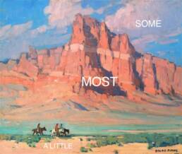
Generally, the strongest compositions are generally an arrangement of three or four large masses.
If you took a black and white photograph of your painting, the shades of gray would represent the different values within the painting.
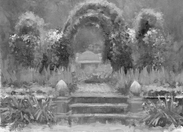
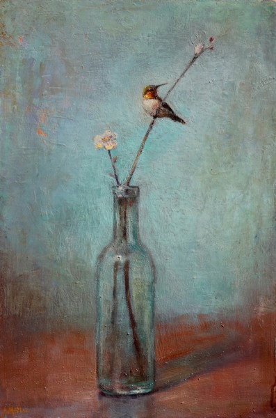
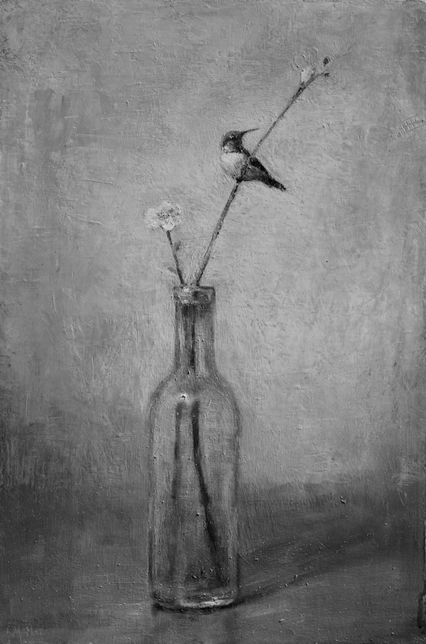
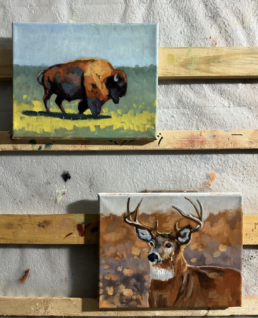
The same principles are used in painting still lifes as well. Note how the painting below reads well in color, and also in values of black and white.
Use value to create a focal point of interest in the painting. Remember the eye is attracted to the ‘dark against light.’ The hummingbird is the darkest dark against the lighter background – thus, creating the focal point. In the landscape above, notice how the garden bench leads your eye into dark arbors.
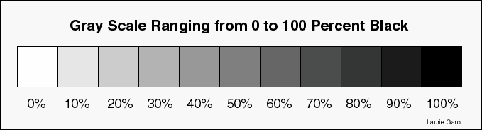
Value Scale
Value is the range of light to dark of either neutrals or colors. The two extreme values on this scale are white and black.
Like notes on a piano, artists can make paintings that are high-key, mid-key or low-key. Mid-key paintings risk being dull and flat, and this is quite common among amateur artists.
Believe it or not, value is more important than color to the design and success of a painting. Value is often used to create the focal point within a painting or drawing. The human eye is immediately drawn to the lightest light against the darkest dark, which helps create the focal point of interest.
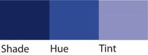
- A shade is created when only black is added to a pure hue. This darkens the color. However, a hue can also be made darker by adding its complimentary color rather than black. For example: Green + Red, or Violet + Yellow, or Blue + Orange when combined produce a dark shade of gray that can be used instead of black.
- Adding white to any pure hue on the color wheel creates a tint.
- Remember, tones, tints and shades also reduce the saturation or intensity of a color and adds to the dilution of the original hue.
4 Types of Value Planes
The 4 Types of Value Planes were originally taught by American Impressionist John F. Carlson (1875-1947) to help students create a cohesive and harmonious painting. Today, successful landscape painters usually keep their composition limited to 4 value planes.
-
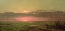
- The Sky: The lightest value plane in a painting. Don’t paint this a highly saturated blue; it will be too dark a value when compared to the light passages in the land. Remember the sky is the source of light.
- Ground Planes: The second lightest planes because it received more light from the overhead sky.
- Slanted Planes: Mountains, hills and other angled planes receive less light from the sky.
- Upright Planes: This includes anything upright or vertical such as trees and buildings. Upright planes receive the least amount of direct light from the overhead sky.
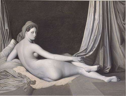
About Grisaille
Some artists paint their whole underpainting in values of gray or another monochrome (the term ‘grisaille’ is misapplied) neutral color. They let this dry before painting over the top with color. This technique is called grisaille. Ingres was noted for this as seen in the painting below. Rubins painted in brown monochrome values which is not true grisaille, but is still a very popular way today for laying in values.
*****
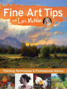
To learn more helpful art tips be sure and check out and preview my new book > Fine Art Tips with Lori McNee
Painting Techniques and Professional Advice 🙂
Fine Art Tips goes “behind the paintings” to show how 24 of today’s top artists transform paint into incredible still lifes, landscapes, portraits and wildlife art. Each artist shares practical, real-world tips for representational painting in oil, acrylic, and pastel. Learn how to provoke emotion, paint monochromatically, develop a focal point, and so much more!
Thank you for sharing your knowledge with us, Lori. The “tone” is also sometimes referred to as “chroma” or “saturation”, right?
It’s also very interesting how the different “schools” of the old masters use the monochrome painting. Some use grey, some use green, some use blue. And I forgot all the different names they call these different monochrome underpainting. Some Italian words, maybe?