
Neutrals are any set of tones created when mixing two complementary colors and any amount of white.
In the beginning, I failed to realize the connection between using both neutrals and saturated colors in my paintings, and ultimately my work suffered. But, when I started thinking in terms of neutrality and saturation my work dramatically began to improve. Over time I became more sensitive to subtleties and shifts in color temperature.
In the overall scheme of things, neutrals are just as important as the pure tones in a painting. So, it is important not give them any less attention simply because they are not the main focus of your work.
I believe many artists underestimate these tones because they don’t seem to have any significance when dealing with the color wheel. But remember, there are 2 sides to everything…
“The brighter tones could not be so bright without the neutral tones.”
“The neutrals are what make the bright colors more vibrant and more interesting to the entire scene.”

For the most part, we all know that the average person is attracted to bright and saturated colors. When we go outside or in a store or almost anywhere, we see bright colors in advertising, street signs, lights, on clothes and cars.
So, it makes sense that most artists like to use bright and highly-saturated tones when creating a painting to attract viewers. The problem with this is that when using mostly bright tones, the viewer’s eye doesn’t know where to look and everything in the scene is shouting. Your painting can potentially come across unnatural, unpleasant and flat. This is why using neutrals can be so important to improve your work.
So how do you mix a neutral?
Take the complementary colors of the color wheel:
- red and green
- blue and orange
- purple and yellow
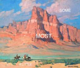
By mixing any of those pairs of color together, you will get a neutral grey or brown. Neutrals provide the viewer a break from the intensity of highly saturated tones while also complementing and balancing them.
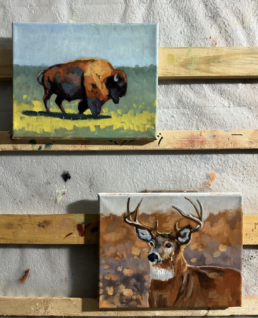
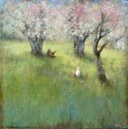
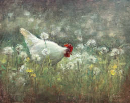
Neutrals also create interest and provide subtle but important variation for your pieces. Understand that nature is a lot more neutral than you may realize. For instance, green grasses may actually be a neutral green, toned down with subtle red and purple tones.

Neutrals are quite versatile due to the fact that you can add in more of one of the complementary colors, such as red and create a redder, warmer neutral. The same can also be done to create a cooler neutral by adding blue or a subtle, cool purple.
Neutrals create a sense of depth and recede into the distance when used with brighter color tones. When painting objects in the distance look to your neutrals. There is usually less contrast for objects far away, especially when compared to objects that are closer to you.
By maintaining a nice balance of both neutrals and saturated tones, you will be able to create interesting compositions with a sense of depth and space throughout your work.
Guest artist/author: Brandon Schaefer is a young landscape painter from Delaware. Brandon is passionate about acrylic painting because of the bright colors and layering process he can achieve. Be sure to check out his informative blog!
*****
Thanks for visiting FineArtTips.com. You can see my art on my website, LoriMcNee.com, and let’s meet on Facebook Fine Art Tips Facebook Fan Page, on Twitter, Google Plus and on Pinterest. Be sure and check out and my fine art prints and notecards on Fine Art America.! ~Lori

Once again an excellent piece! So informative and helpful! Can’t wait to go and mix up some Neutrals!
Hello Molly, it was great to get your tweet and then to see your comment here too. Glad to hear this post resonated with you. Yes, those neutral tones really make a painting pop! Good luck. ~Lori
This is a great read. I often forget about neutrals because I get so wrapped up enjoying and developing the pure tones.
Glad this post served as a reminder. The quiet tones make a painting sign! Thank you for the great feedback… 🙂
This is so true! Contrast is very important. Neutral / Saturated colors, Shadow / Light etc.
Thanks for the great tips, Brandon.
Neutrals are not only versatile but they are also known for their realistic and natural looks. It is indeed a beautiful feeling to witness an art with such grace. I completely agree that neutrals extend depth in painting and cover up the shallowness and minor flaws. Thanks sharing this post and those lovely pictures, Glad reading 🙂
Hello Barbara, thanks for sharing your extra thoughts about neutrals. The quiet colors make those paintings sing! Glad you enjoyed this post 🙂