 This past weekend I was feeling unmotivated in the studio. I have just finished painting still lifes for the winter season and now must make the switch to painting landscapes for my summer shows. I enjoy bouncing between the two disciplines, but lately nothing seemed to inspire me.
So, here is what I did…
- I decided to have some fun and experiment with color harmony or complimentary colors.
- Pairs of colors that share no common elements with each other are called, ‘complimentary colors’.
- Instead of my traditional palette, I chose to experiment with a revolutionary idea of painting using the 5000 year old yin/yang approach.
- The ancient Chinese understood our world in terms of a balance of opposites. Everything in nature has its opposite.
For example:
- moon/sun
- black/white
- day/night
- sunrise/sunset
Every color has its opposite too! Each ‘primary’ color or hue (red, yellow, blue) is directly opposite a ‘secondary’ color (green, purple, orange).
These complimentary colors are always found opposite each other on the color wheel:
-
Red – Green
-
Yellow – Purple
-
Blue – Orange

When opposite colors are mixed they create beautiful, chromatic neutral grays. Using this technique, I limited my palette to the family of complimentary colors I felt were best suited for the subject being painted.
Out of the three yin/yang palette possibilities, I chose the blue and orange palette.
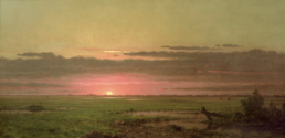
This is the landscape reference photo:


“Mountain Gold – Adam’s Gulch”© 2010 Lori McNee
For the ‘orange’ pigments I used:
- cadmium red light – warm orange
- cadmium orange – true orange
- cadmium yellow medium – cool orange
- burnt sienna – softer orange
For the ‘blue’ pigments I used:
- ultramarine blue – warm blue
- cobalt blue – true blue
- phthalo blue – cool blue
and ivory black & titanium white
You can vary the above colors with your own choices, but it is best to always have a warm, true & cool representative for each opposite color. These complimentary colors vibrate when painted next to each other and are beautifully muted when mixed. A broad range of colors can be mixed from this limited palette. The results are harmonious and color intensity can be controlled.
I was able to mix luscious greens, rich browns and vibrant autumn colors next to quieter grays. I am please with the results and plan to try painting a series of landscapes using the yin/yang palettes.
For more information I suggest reading The Yin/Yang of Painting Also, using the color wheel can help you determine color schemes balance and harmony in your artwork, web-pages, designs or home decorating.
Happy Painting – Lori
Lori,
Many thanks for your insightful articles and art tips. As an avid painter, I’m always look for new tips and tricks and you’ve been a big help to me.
Regards,
John Lawson
Thanks John. It is always a very nice compliment to receive good feedback from avid painters such as yourself.
Happy painting!
Lori
I love this blog, more grease to your elbow Lori!
Thanks Dammy! I will keep working hard. I appreciate the feedback.
Lori
awesome brush work
I was browsing the net for color harmony in oil paintings, when i came cross your post! great article i found it very helpful, i am going to try this in my next painting.
Great Tadj, I am glad this post inspired you. Thanks for taking time to let me know. I’d love the hear how your painting turns out.
Best,
Lori
Lori, this is a great article. I have used a similar technique when priming a canvas before starting to paint. I will paint the entire canvas in a complementary mid tone colour. For example when doing a seascape of mostly blue I will underpaint with burnt sienna. The ‘shadow’ of burnt sienna under the blue gives an extra vibrancy, especially if little parts of it show through. I also like how you posted your reference photo next to the finished painting and would love to see more of those comparisions
Thanks for enjoying this post. I love using the compliment for the underpainting too. I will plan to do more photo/landscape painting comparisons in the future. Thanks for your feedback 🙂
The color wheel shown here shows yellow opposite violet, whereas some other color wheels show yellow opposite a kind of ultramarine blue. Why ?
Hello Paulo, many apologies for the belated reply. I am not sure of this answer except to guess those charts are considering Ultramarine Blue a violet? It is a warm blue. That is my best guess…
This was a good lesson for any landscape painter – I found it simple and useful and like the recipes!
Oh good Chris! I’m glad you enjoyed trying this new way of creating a palette. Thanks for the visit.